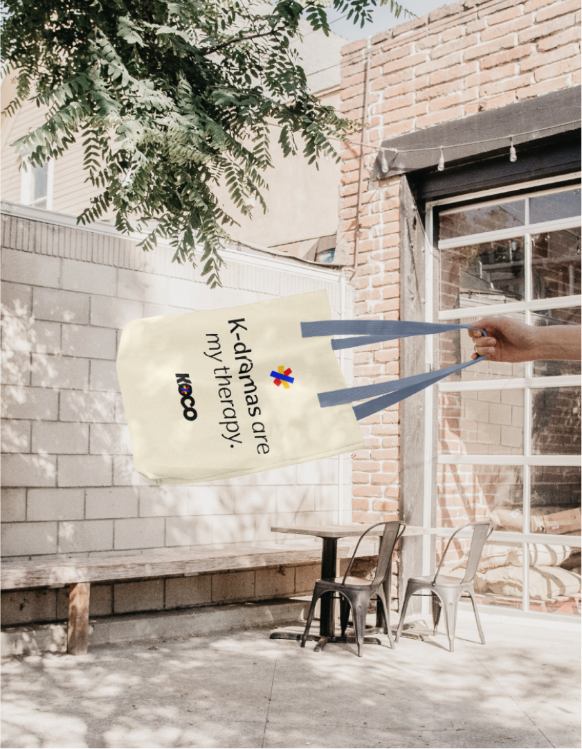
Branding for KOCO, a Korean Conversation Center in New York City.
Process
Discovery Phase – Concept Phase – Design Phase – Delivery
Creative Direction
After the discovery phase, interviewing the stakeholders. I took inspiration to the original idea of the bold fonts and the chat bubble, and gave it a contemporary aesthetic.
Through competitor visual analysis, this brand strategy was to approach the logo in a simplistic and bold manner; to help the logo against known competitors in New York City and to target New Yorkers who are more used to bold western branding in the myriad of billboards in the city.
To bring about the professionalism and the trustworthiness into the brand, I’ve used modern sans-serif fonts and kept the colors closer to the traditional Korean “SamTaeGeuk” however, I reinterpreted the symbol to push away from traditionalism to be approachable and friendlier.
Created an icon to add to the friendliness of the logo. A logo symbol that would represent Koco’s business focus about Connections, Diversity, and learning Korean.
Date
2023-2024
Role
Creative Director + Designer
Delivery
Brand Identity for KOCO with the theme of Simple, Bold, Trustworthy, Professional, Friendly.


