Crafting Bella 45’s
Persuasive Premier Website
for an Evocative Golfing Lifestyle
Projecting the Future Golf Resort Experience to Secure $100M in Memberships
Outcome
Sessions grew from 242 to 18.5k in two quarters, with a 3,917% initial jump followed by a 90.1% increase, highlighting our outreach success.
Leveraging UX methodology, site's CTAs boosted from zero to 85 calls and 67 inquiries in the first month, offering key behavior insights for timely refinements.
Dual-function website strategy integrating the site as a digital brochure, reduced presentation times from 40 to 15 minutes, leading to 1,250 more pitches in 500 hours.
Strategic design approach eliminated a 6-week preparation phase, fast-tracking client engagement for our sales team.
Date
2022
Role
Lead Product, Brand, & Web Designer
Duration
6 Weeks
Platform
Web
Industry
Golf Industry
Tools
Figma, Wix
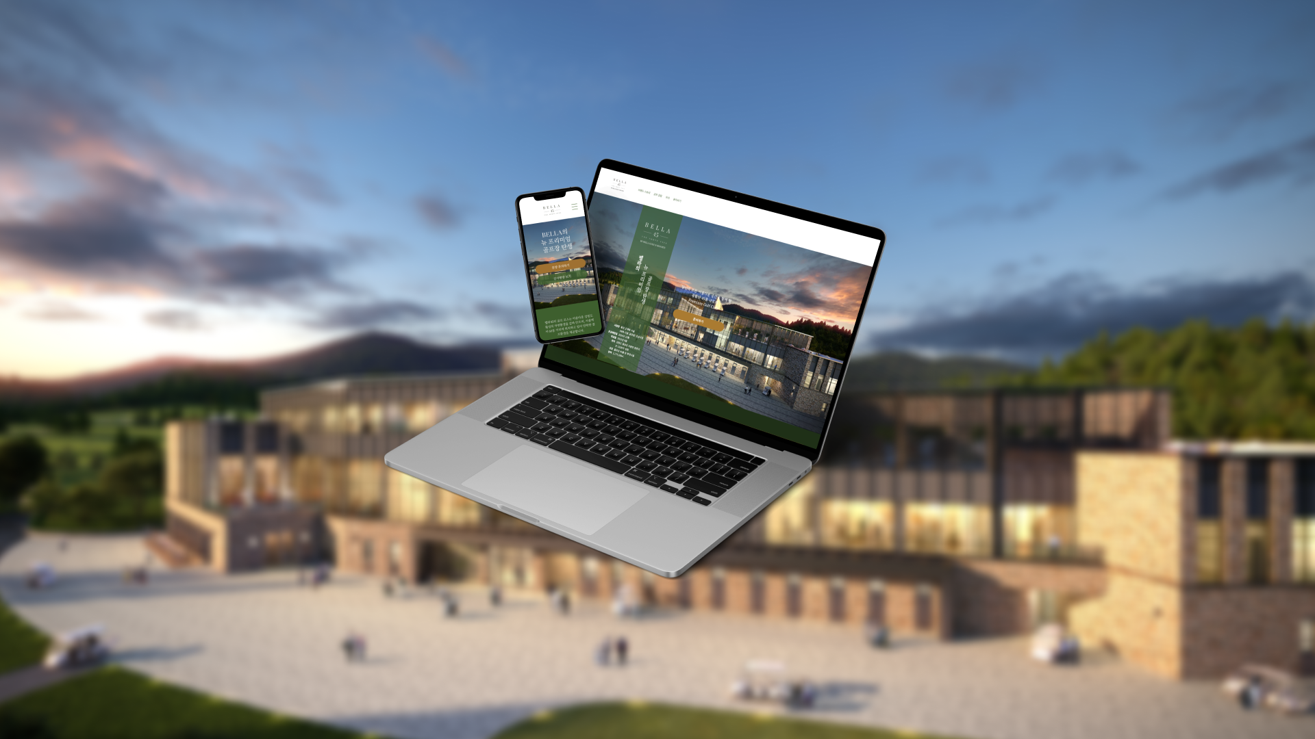
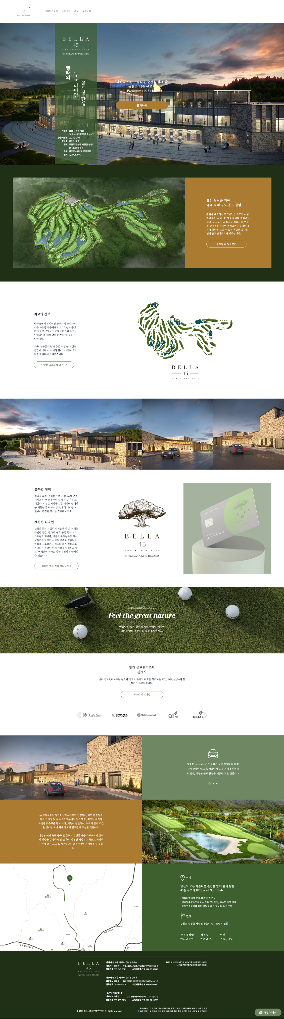
SOLUTION
A Top-tier Website offering the golfing experience of a yet to be constructed golf resorts to help sales team sell $100M in club memberships.
Problem Statement
The client sought a website for their in-progress golf resort, unaware of its pivotal role as the first digital touchpoint for customers. Their sales goal was $100M in memberships before construction ended.
Realizing the gravity, I recognized the website wasn't merely an aesthetic endeavor but a crucial bridge between potential members and the brand. The aim was to design a site for Bella 45 Golf Resorts that both encapsulated the resort's essence and steered prospects towards the $100M target.
This project shifted from creating a mere site to crafting a potent digital experience that aligned with the resort's vision, building trust, and enticing visitors to embark on a luxurious membership journey.
Backstory
While the client asked for an abstract website, I delved into the project’s specifics to discover its role in the grander scheme of the project.
The client sought a website for their under-construction golf resort. As I delved into the project's specifics, I realized that the sales team had the high-stakes task of securing $100M in memberships before construction finished. This website wasn't just about aesthetics; it was the crucial first digital interaction with potential members, setting the tone for the brand.
Understanding the gravity, I reframed the challenge: Design a pioneering digital touchpoint for Bella 45 Golf Resorts, encapsulating the resort's essence and propelling the goal of $100M in memberships.
This wasn't merely a website; it was a digital ambassador for a yet-to-be-completed resort. It had to evoke trust, stir emotions, and vividly present Bella 45's unique offerings. The endgame? To forge an immediate bond between potential members and the brand, enticing them towards membership.
With this revised perspective, I aligned the website's design with the business goals, crafting a digital experience that surpassed the client's hopes.
Challenges
Logistical and design challenges while limiting, pushed for creativity.
Project Specification: The unique challenge was designing a website for a resort that hadn't been constructed yet. The objective was to sell potential members on the vision and promise of the resort.
Client Communication: Our client in Korea had an abstract idea of their needs, making it challenging to pin down specific requirements. There were also difficulties in maintaining consistent communication, given the differences in location and limited updates on available resources.
Time Constraints: With only 6 weeks at our disposal, we were pressed to accomplish branding, design, and gather the necessary resources from teams in Korea.
Financial Restrictions: We were provided with limited renders and had no budget allocated for stock images.
Technical Limitations: We were navigating unfamiliar territory by creating a website for a yet-to-exist product. Coupled with Wix’s limited functionalities and finding alternative ways to represent golf courses, this posed a significant challenge.
Design and Usability: Time zones and language barriers made it tough to seek user feedback and insights. Additionally, we had limited details about the clubhouse's concrete features, relying solely on a broad vision.
Legal Considerations: We had to factor in construction-related timelines, which influenced the overall project roadmap.
Key Solution Points
I created guidance points to address the problem statement with an end goal in mind.
Developing a user-centric website design, emphasizing effective engagement and outreach.
Optimize CTAs, allowing real-time adjustments based on user insights.
Designing dual-function website: visual user interface and a digital brochure, to help enhance the sales team's efficiency.
Strategic design approach for quicker client engagement.
Built with adaptability, ready for content updates in alignment with Golf Resorts' construction phases.
APPROACH
Understanding the current situation and exploring design solutions through research and UX methodology.

Starting Point
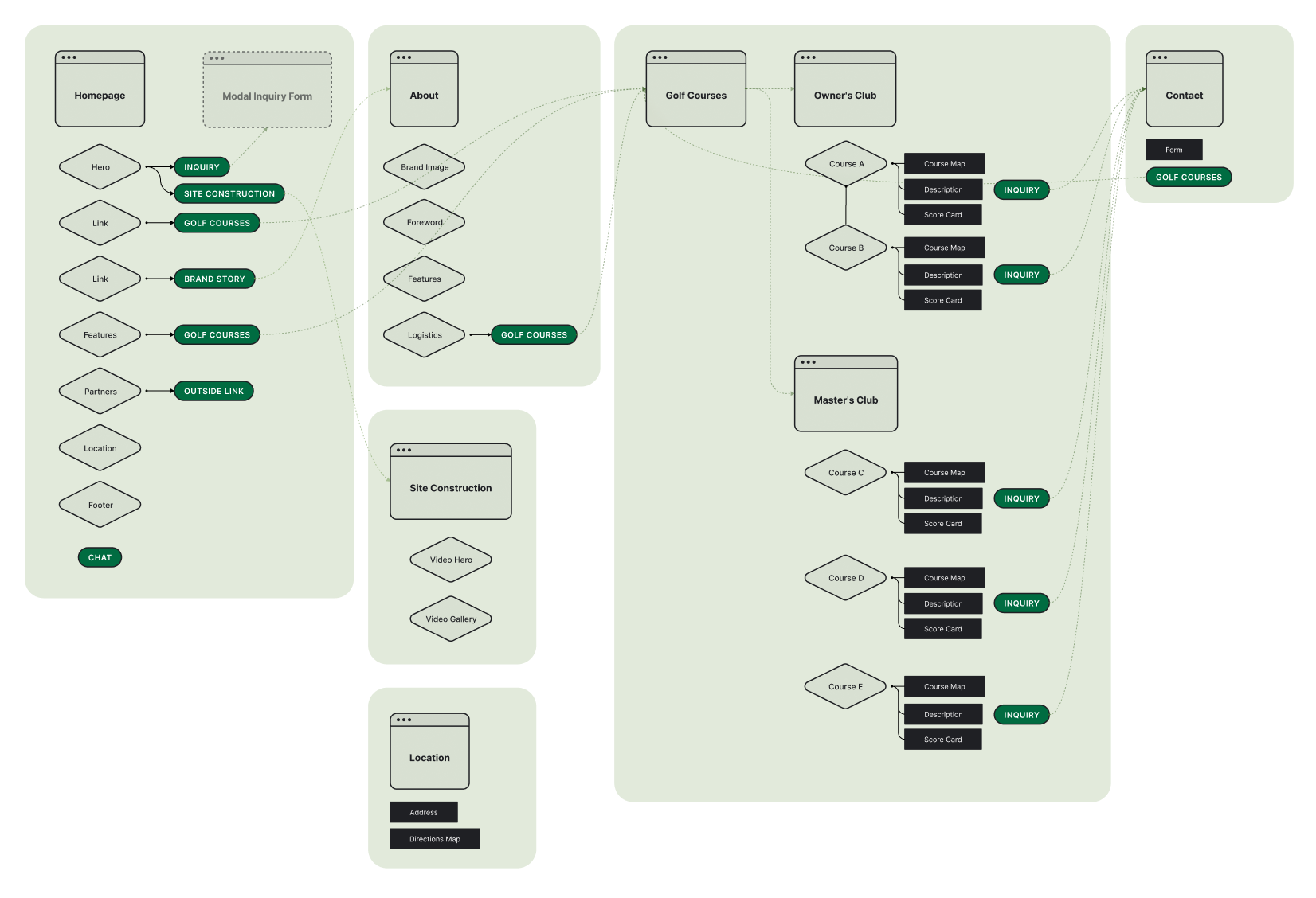
Initiating the project, I was provided a preliminary website version crafted by a member from the client's team. I wanted to first step was to comprehend the existing structure and discern its objectives. Alongside, the client shared a list of desired features and structural needs for the site. Leveraging this, I refined the initial information architecture to encompass the client's specifications, setting a clear path for areas of focus and resources I needed to delve into.

From Passive to Persuasive
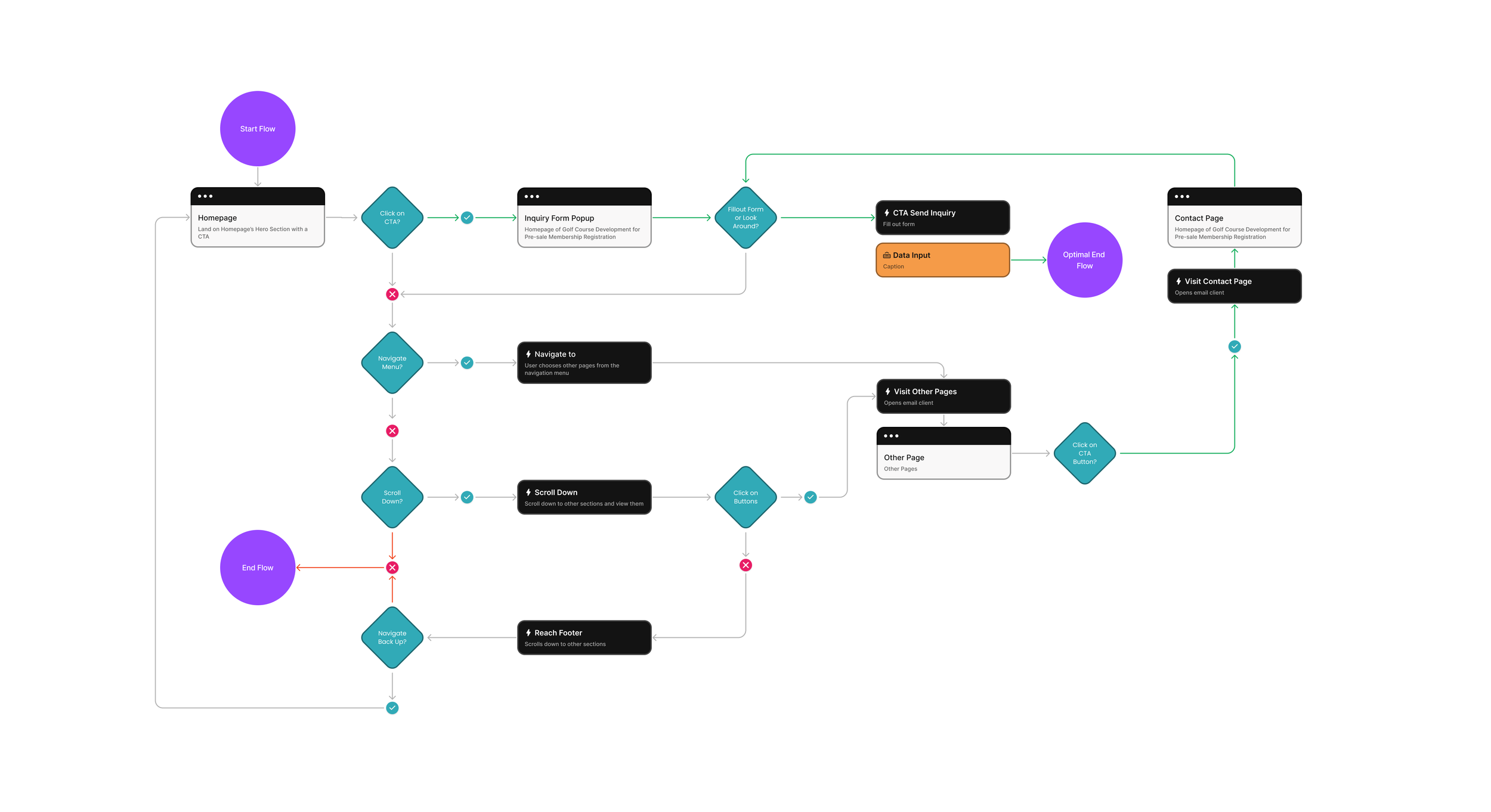
When reviewing the newly structured information architecture, complete with designated CTAs and page functionalities, I realized that the content largely centered on presenting the golf course details and business contact information. The website, as the client envisioned, felt passive. Given its pivotal role as the primary digital touchpoint in the sales process, it was essential for the site to be more engaging and persuasive. I observed a lack of cohesion in the user pathways across the specified pages. Instead of operating as interconnected components of a seamless journey, each page functioned in isolation. Recognizing the magnitude of the task ahead, I began by crafting a user flow for the current website to systematically uncover and address these challenges.
Other Small Decisions
Why the Platform of choice, Wix? A two-fold reasoning backed this decision: its availability in Korean and its user-friendliness, catering to a team that had minimal coding expertise. This was crucial because the website wasn't just a design handoff. It was an ecosystem the Korean team needed to nurture, update, and evolve, ensuring its sustainable performance. Additionally, I orchestrated a freelance illustrator's skills to sketch the 45+ golf course visual stories.

User Flow
I mapped out the user flow for the existing website to identify key UX pain points. Through this analysis, I discovered three major systemic issues:
1. The user's path to the Optimal End Behavior was constricted.
2. Despite following the desired user actions, the penultimate step jarringly disrupted the experience, jeopardizing the completion of the end goal.
3. After reaching a specific point in the user journey, the design unintentionally nudged the user to prematurely exit the flow.
In response, I reframed these issues into actionable user pain points and established new user flow objectives:
1. Ensure the contact CTA is readily accessible throughout the website.
2. Provide a consistent, guided journey without any points of confusion.
3. Maintain a deep, immersive engagement with the Bella45 brand across all website interactions.
Research
Before jumping into my own design layouts I started researching references and benchmarks in industries similar to the project. I came across NFT websites which had a strong empahsize in creating immersive branded websites that always guided the users to a specific goal. It was espeically pertinent in the NFT websites industry being a new industry and people can easily get lost in understanding what they needed to do. It hought the websites from this industry were perfect benchmarking points to start developing user interface ideas and great examples of branding the whole website experience for a project that did not exist yet similar to the golf resorts needing to sell memberships while under construction.
UX and Visual Research
Gleaning from Industry Benchmarks
Before diving into design mock-ups, I sought references from industries paralleling our project's unique challenges. My exploration led me to NFT websites, renowned for their immersive brand experiences guiding users towards a clear objective. Given the nascent state of the NFT market, these sites adeptly help users navigate the unfamiliar, making them ideal inspiration sources. Their approach echoed our challenge: presenting a vision, much like the golf resort selling memberships before construction completion.
Crafting an Immersive Experience
With insights from the client on golfers' preferences, our overarching aim was to design a website that left an indelible impression. Inspired by the compelling blend of visuals and trust-building in NFT platforms, we sought to replicate their expertise in presenting both current offerings and future potential. The goal was to marry captivating design with cohesive branding, mirroring the allure and professionalism these platforms champion.
References NFT Websites
While we leaned into the client's deep understanding of golfers' needs, our goal remained to craft a website that left visitors in awe. To gauge what truly resonates with audiences, we studied NFT websites. These platforms excel in captivating potential investors, merging striking visuals with an aura of trustworthiness. They adeptly communicate key logistics, future prospects, and exude professionalism through cohesive branding. Drawing from this, we aimed to infuse similar elements into our website design.


CRAFTING THE JOURNEY
Visualizing branding and function into one web product.
Sketches: Blueprint of Dreams
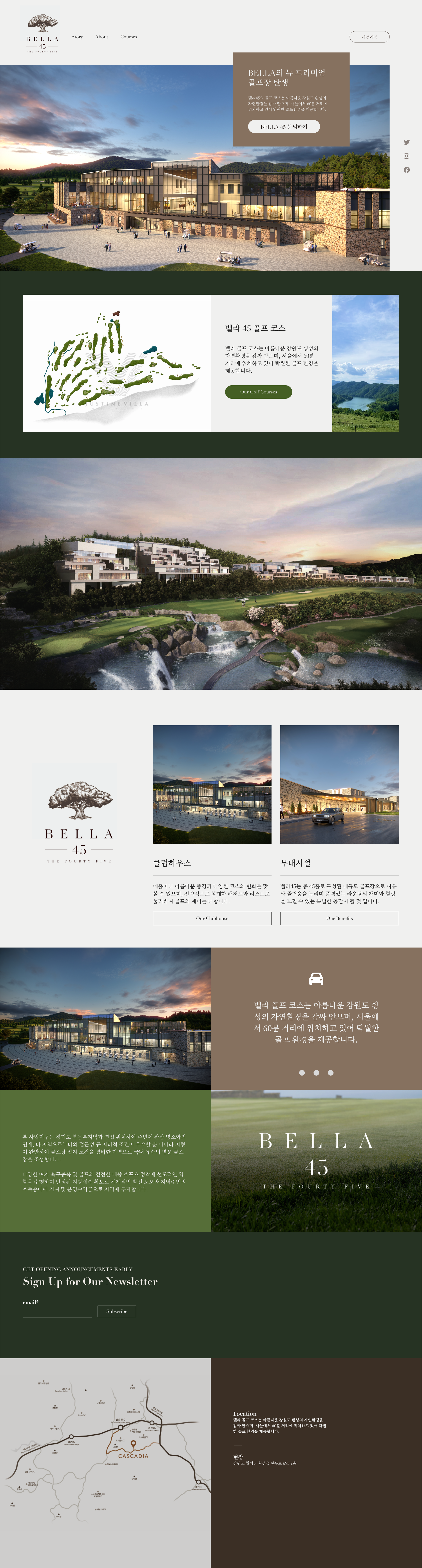
Figma became my canvas. Merging elements from golf and the NFT world, I started sketching the blueprint of what was soon to be a digital marvel.
One of the unique challenges and privileges was having the CAD files of the golf courses handed to me. It provided a concrete foundation, allowing for an intricate and accurate representation in the designs.
Visual Iterations
Strategically created a branding system to persuade users of a new upcoming luxury brand. I wanted the users to feel familiar and excited for the golf resort in development. Used a calmer green tone with a golden tone to give users a relaxed experience while in the website.


CONCLUSION